A few days ago I introduced a basic statistical tool (the capability index) that is simple and can be represented visually, so that any Chinese factory can understand it and try to improve it.
Today I want to introduce the p chart. It is quite simple, yet is seldom mentioned when control charts are mentioned.
The most common type of control chart is not very appropriate
The “classic” control chart tracks the average value and the amount of variation of a particular value of interest. They are called “X bar R” charts.
They were developed in the 1920s in a company that enventually morphed into AT&T. If implemented correctly, they give production operators an awareness of the way a process is doing and can guide them to detect unhealthy patterns. All very good.
Unfortunately, this approach needs to be set up and then supervised by someone who understands the statistics behind the charts… Or they are misused. In other words, they are not a good fit for 99.9% of Chinese factories.
Advantages of the p chart
Over time, different types of control charts were developed. And one of them, the p chart, is a good fit for Chinese suppliers, for several reasons:
- It displays some data points they are often already collecting,
- It can be done on Minitab or equivalent software by a dedicated office person (not by production operators or team leaders on the shop floor), which is their favorite way of doing things,
- Its interpretation doesn’t require statistical training.
How does the p chart work?
Let’s take an simple example. A trading company sends inspectors in a factory to check every shipment, and follows the traditional approach (random sampling based on ISO2859-1 with AQL of 0, 2.5, and 4.0).
Over time they compile a database of results — in particular, how many defects were found in each inspection.
(For simplicity, I assumed the number of samples is always 200 pieces.)
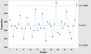
If they plot their last 40 findings (from the same factory on the same type of products), it looks like this:
(Click on the image to enlarge it.)
What can we conclude?
- The factory’s average defect rate is 5% on finished products.
- Their processes, generally speaking, seem out of control. There is not only strong variation, but also 2 high points are more than 3 standard errors away from the average (finding such a high point should only occur 1% of the time on average).
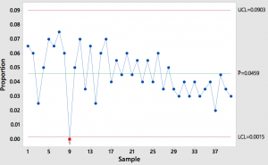
Let’s take another example:
What can we conclude?
- The underlying processes seems to be more in control. There is lower variation over time (to the right of the graph), so it will soon make sense to drop old points and recalculate control limits on a new graph.
- The downward trend looks good. Obviously, the fewer defects the better.
- 1 point is below the lower control limit. The supplier should check who did this inspection, with what method and what testing devices, etc. It is suspect.
Adding a bit of complexity…
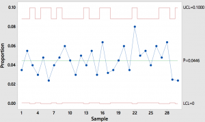
In reality, the size of the batches varies, which means the number of samples also varies. Since the number of samples is part of the formula behind the control limits, those limits will go up and down too.
I prepared a simple example with the sample size varying between 125 pcs and 200 pcs. Here is what it looks like (notice the red lines go up and down).
Fortunately, the software takes care of this. There is no added work for the supplier!
Requesting a p chart from suppliers
As a buyer, you can request your suppliers to provide p charts to you on a regular basis.
If they won’t do it, you should probably do it yourself, or with the help of your quality manager (or inspection service provider if you outsource QC inspections to a company like ours).
A p chart displays trends (on the rise, stable, wide variations…) and an average that can be used in your supplier evaluation system, and the discipline of filling it out will push your suppliers to do self-inspections more carefully.
What do you think?


